COVID-19-Analytics
Coronavirus disease (COVID-19) data analysis Worldwide
(last update: 3 April 2020)
Ongoing data science pipeline to process, analyse and visualise COVID-19 pandemia data. The intented goal is to illustrate with data cleaning, processing and visualisation pipelines, the most update packages and libraries for doing Data Science with R

The current outbreak of coronavirus disease (COVID-19) that was first reported from Wuhan, China, on 31 December 2019.
Since mid-february, Johns Hopkins CSSE reports the number of diagnoses with the coronavirus and their residence on a daily base. The data contains the total number of positively tested (confirmed), deaths and recovery patients. ~The raw dataset can be found on the github repository. This dataset is daily updated.
This is a developing story :exclamation: Daily updates :exclamation:
Datasets:
Tips for improvements
Suggest on this project is appreciated. I am looking for new features for the data pipelines.
See data science pipeline for technical details regarding data collection and cleaning.
:chart_with_upwards_trend: Graphs globally
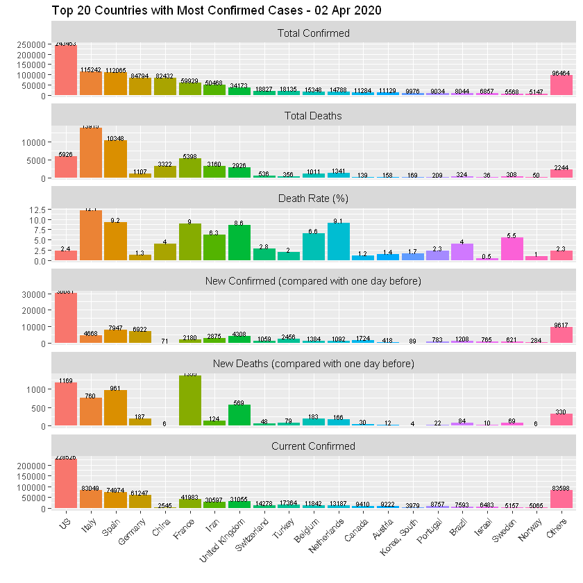
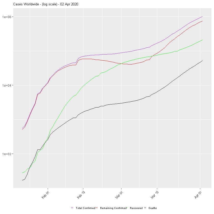
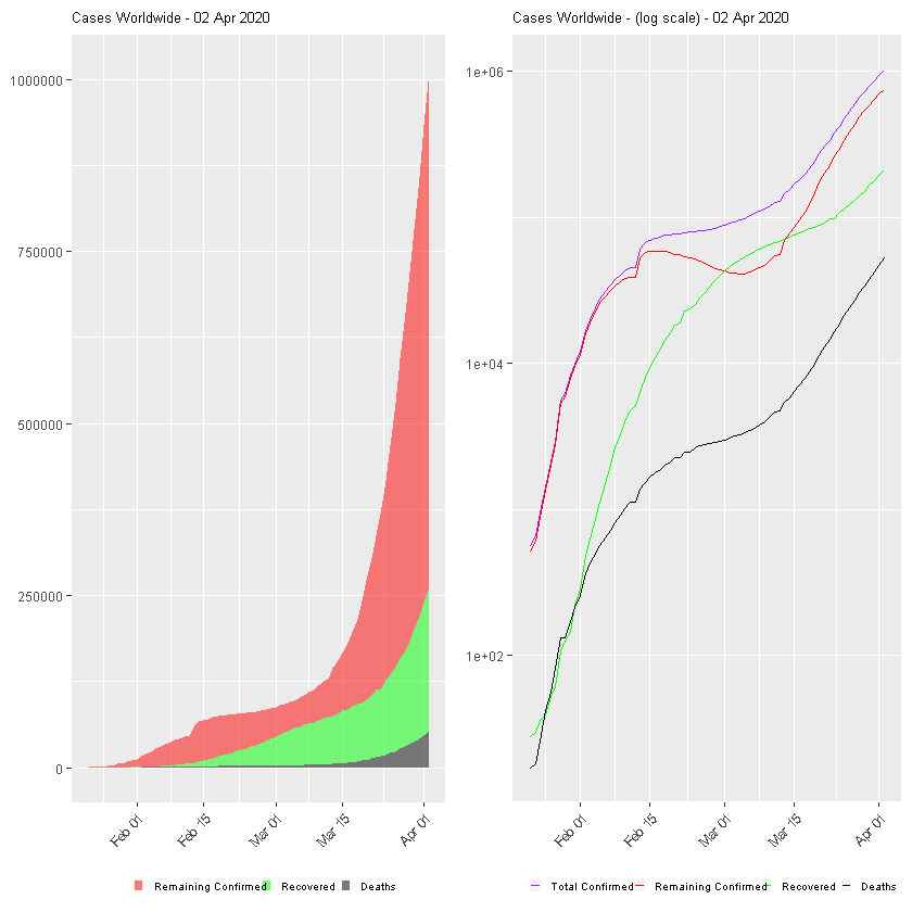
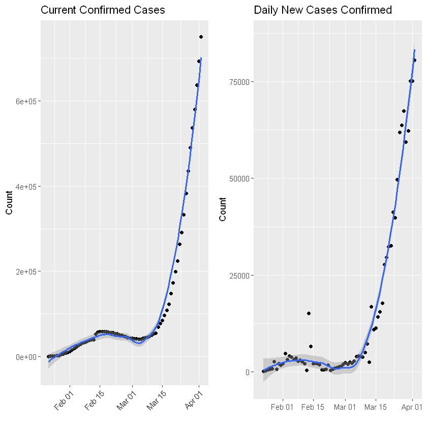
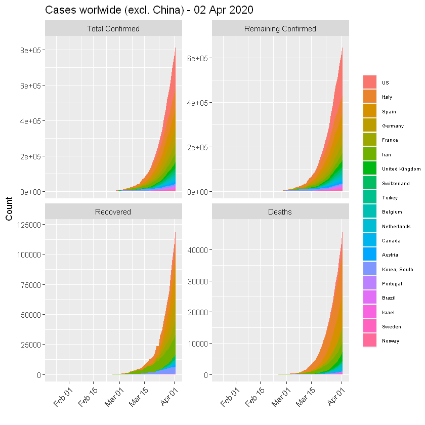
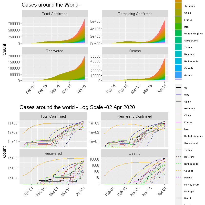
The following graphs show the development of Coronavirus consequences on a daily basis. The outputs are updated on an daily basis and are generated automatically.
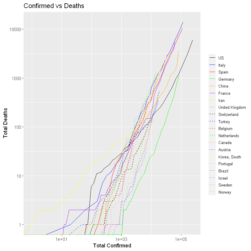
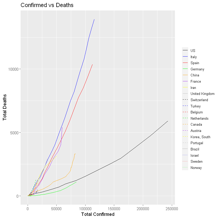
More visualisation outputs
TOP 20 Countries
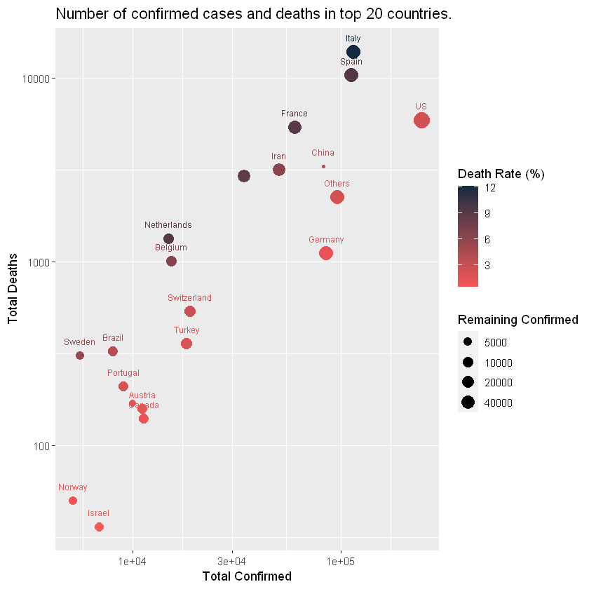
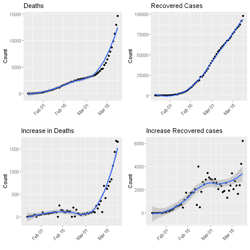
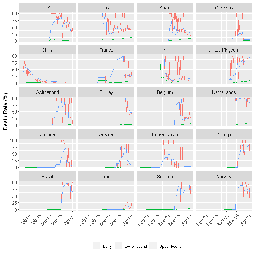
Death rate!
Ranking Tables [Deprecated]
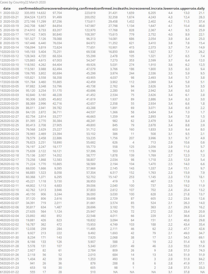
Case by country
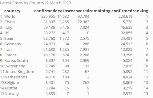
Top 15
Reference and reproducible output
The pipeline is inspired by Yanchang Zhao. Citation:
COVID-19 Data Analysis with Tidyverse and Ggplot2 – Worldwide. RDataMining.com, 2020.
Output for Jupyter COVID-Descriptives
PDF Format COVID-Descriptives
Contact
Please connect with me c.utrilla.guerrero@gmail.com